Web design is constantly evolving, and as technology advances, so do the ways in which designers enhance user experience. One of the most effective ways to do this is through the use of microinteractions and animations. These elements, when used correctly, can make a website more engaging, interactive, and memorable.
What are Microinteractions in Web Design?
Microinteractions are small interactions within a website or app, such as a button hover state or a pull-to-refresh gesture. They often provide feedback to the user, such as indicating that an action has been completed or an error has occurred. Microinteractions can also be used to guide the user through a process, such as a sign-up form, or to help them discover new features. They are a subtle yet powerful way to create a more seamless and intuitive user experience.
What are Animations in Web Design?
Animations, on the other hand, are used to bring a website to life and make it more visually interesting. They can be used to guide the user’s attention, such as by highlighting a call-to-action button or to provide feedback on an action, such as a button press. Animations can also be used to create a sense of movement and energy on the website, making it more engaging and dynamic. When used in conjunction with microinteractions, animations can create a cohesive and engaging user experience.
Purpose and Performance
It’s important to keep in mind that microinteractions and animations should serve a purpose and enhance the user experience, rather than being used for the sake of it. It’s also crucial to ensure that the animations and microinteractions are smooth and responsive, so as not to negatively impact the user experience.
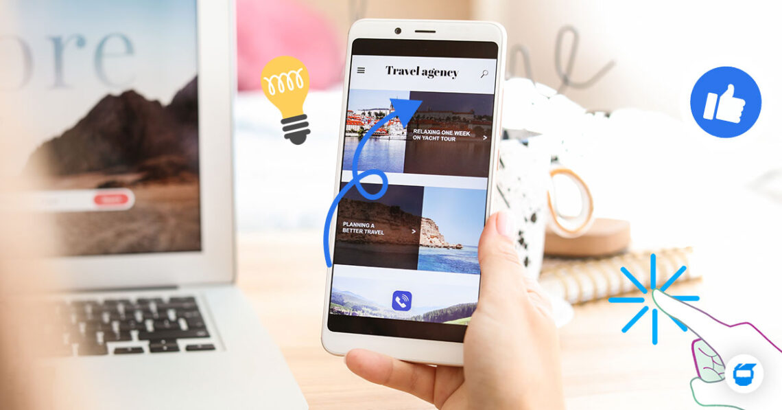
Regarding microinteractions, designers should focus on making them as simple and intuitive as possible. It’s important to keep in mind that the user should be able to understand the microinteraction without needing to think about it. For example, a ‘like’ button on a social media site should be obvious and easy to use, rather than hidden or difficult to find.
When it comes to animations, it should be used to add visual interest and guide the user’s attention. But it’s also worth noting that too many animations or lengthy ones can be overwhelming and distracting for the user. Instead, you should be able to strike a balance between adding visual interest and not overwhelming the user.
Inclusivity
Inclusive design is also a vital aspect to remember when incorporating microinteractions and animations into a website design. This means that the website should be accessible to users with disabilities, including those who are blind or have low vision, and those who have cognitive or motor impairments. By ensuring that a website is inclusive, designers can make sure that the website is usable by a wider range of users.
Microinteractions and animations are key elements of web design that can help to enhance the user experience and make a website more engaging and interactive. By keeping in mind their purpose, performance, and inclusivity, designers can use them to create a more dynamic and enjoyable user experience. The use of these elements in web design is becoming increasingly important as technology advances and users come to expect more dynamic and engaging experiences.
Do you need help with the web design for your business? Contact us today, and we’ll be glad to assist you!


