How to Make an Effective Call-to-Action for Your Website
You want people to do something once they land on your website. It may be them viewing your content or looking at your services but what’s the best thing that they can do is to fill up that form that you have on your website called Call-to-Action.

This could be the user allowing you to send him/her updates from your website, the user could send you inquiries about a specific product or a user purchasing your product. But how do you create an effective Call-to-Action (CTA) for your website? Here’s how.
1. Strong Command Usage
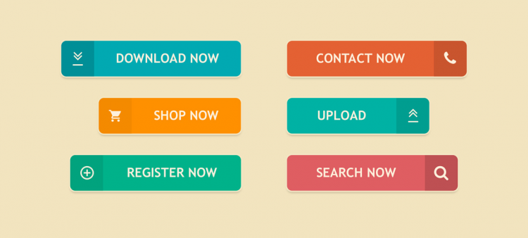
Be clear and concise with your CTA. Tell them directly what you want them to do. Use actionable languages such as “download now!” “contact us today!” “send us a message!”, these are some of the most commonly used CTAs on websites.
Here’s an example in differentiating approaches with or without Call-To-Action. Our new latest poster is out! vs. Download our new latest poster now! Most people might opt to download since the action is there, the word commands the person to click on that button to get that downloadable poster. Users would prefer knowing where and how to get the content they want rather than telling them that’s it’s just available.
2. Take Advantage of the Fear of Missing Out
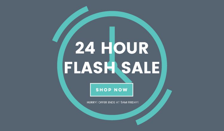
This is also known as FOMO for short. This type of CTA allows users to think about getting it right now or at the moment since there could be such time on the product or service being provided by a business.
These CTAs are effective when it comes to online shops. You will be seeing some examples such as “5 hours left before the sale ends!”, “sale ends tomorrow”, “get this free course today!”. It enables the user to think twice of getting it this time or to get it on another time where the sale might be gone. This CTA provokes enthusiasm on a product or service and a great and effective use for e-commerce.
3. Pay Attention to Position
You should know where to place your CTA button and that depends on your website and the effectivity of that position. Place your Call to Action button in a place that can be easy viewed by a user. It could be above the fold or even on our entire screen.
4. Color and Design
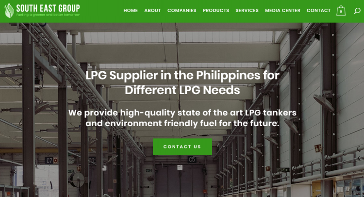
South East Group’s Website and CTA by WAZILE
Every color brings a different feeling or mood with people. This can result into different reactions once a person is seeing a different color. Colors and design are very powerful when it comes to certain feelings. They can attract your users into clicking your CTA button. There are four aspects into generating an effective CTA button, placement, message, design and color.
An example is when you have large buttons, choose a color which is less prominent, and for smaller buttons, you might want to opt with a brighter color. Then again, in whatever color you choose, make sure your button is noticeable without interfering your website’s over all design.
5. Make it Easy
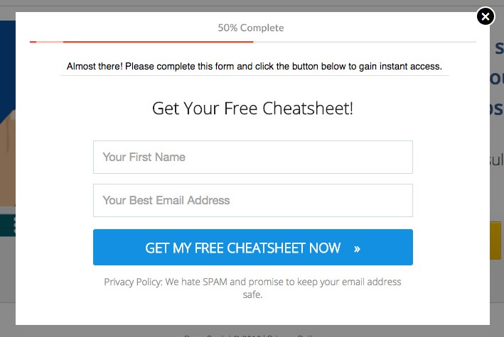
Allow the users to fill up the form on the spot! This could be connected to the position of your CTA button too. Allow users to fill up what you only need. Adding too much options on your form could make the user feel like it’ll take longer than just a minute to fill it up.
It takes time to create a persuasive Call to Action button. It needs to be simple and concise for a user to simply understand what you offer and how to reach you in a quick manner.
For ideas on your website’s Call to Action, contact us today for we can help you with that!


