The way websites were designed before is different from how they are designed today. Since people spend a lot of time online, it’s essential to come up with a way to engage them. Websites nowadays are more interactive, accessible, intuitive, and easy to navigate, but apart from that, they are also visually appealing. The visuals play such a significant role in web design that it can affect even how you’ll make a positive first impression on users, increase revenue, establish brand identity, keep up with competitors online, and more.
With the busy online world, you’ll be vying for the attention of your target audience — which would be back-breaking if you’re not up to finding new ways to level up your game and be open to evolving techniques. That’s why the job of web developers and designers gets even more interesting because they have to come up with a design that is able to connect with every user or visitor; something that will not only stop at catching their attention but also something that can be exceedingly competitive.
Looking for new web design ideas? Don’t go anywhere — because in this article, we’ll be discovering more about ingenious web design your business should try.
Related: 8 Reasons to Get Web Design Services in the Philippines Today
1. Large Typography
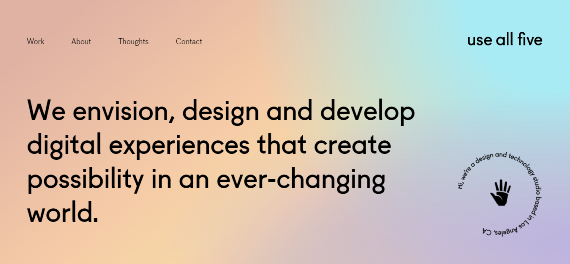
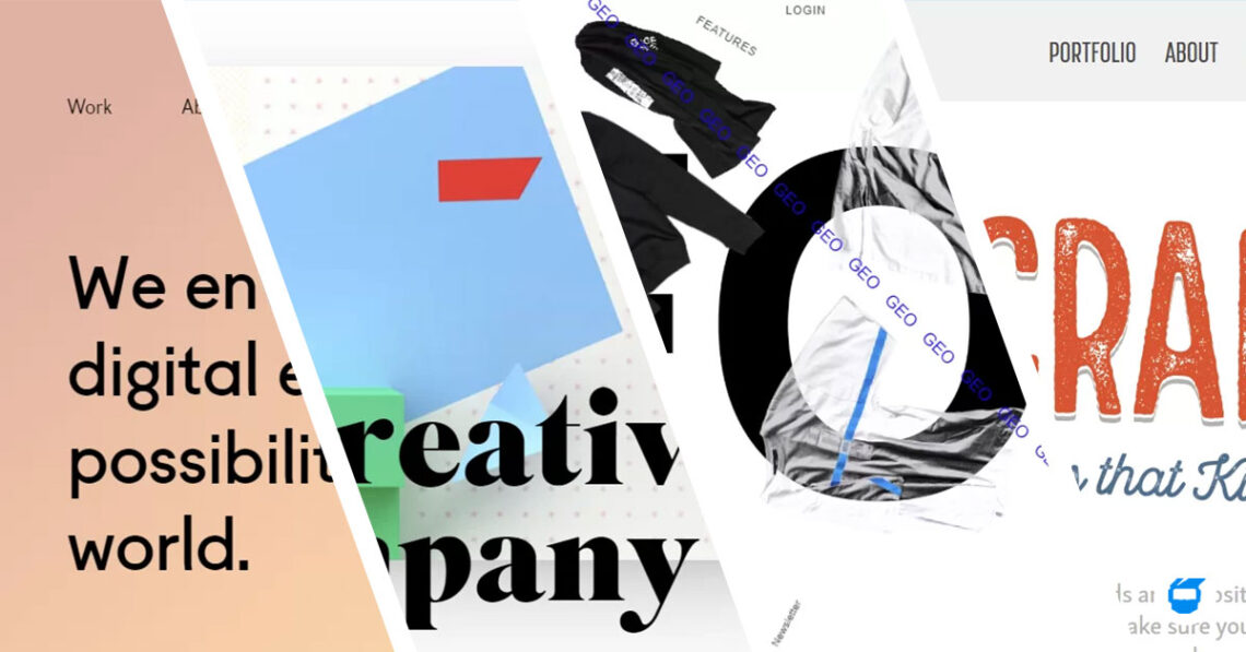
Rather than images, why not go for something different? If it will suit the voice of your brand and its character, you can try large typography. Large typography is one of the most trendy web designs today because of its oversized typefaces that naturally grab the attention of website users or visitors. It’s ideal to incorporate it into your web design, especially if you want to make an impact and be able to clearly communicate what your products and services are all about to every user. However, it’s important to maintain a simple background when you’re using large typography, so that the statement you want to highlight will completely stand out without having to fight against a very colorful background. Balance is a good thing to always apply in every web design as it contributes to the UI or user interface.
2. Brutalism Web Design
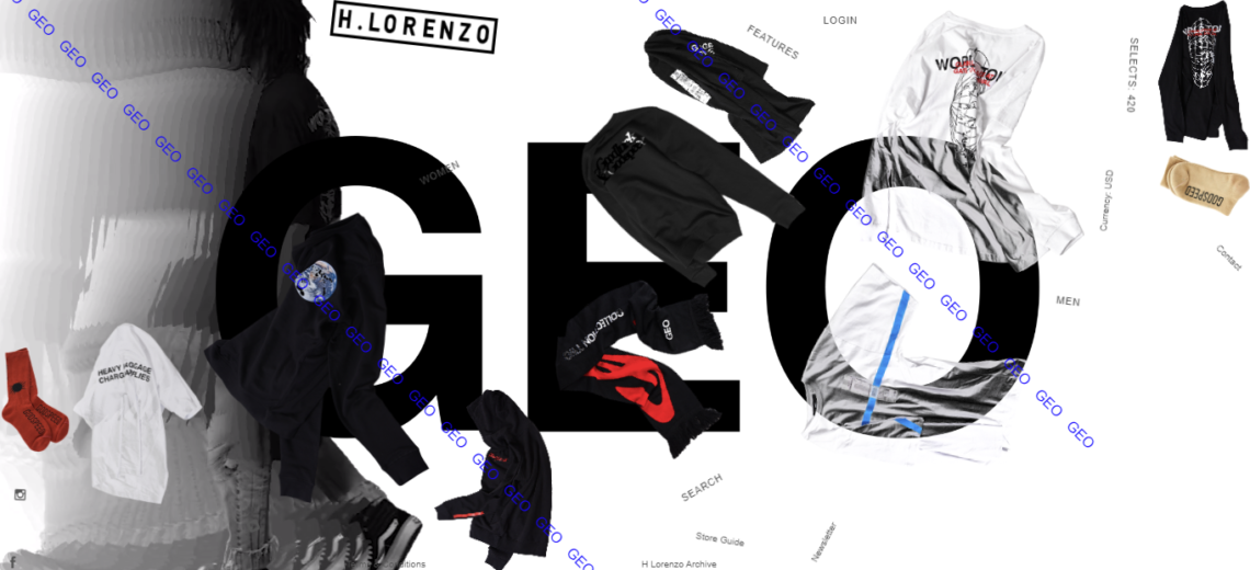
Designs come and go as new trends arise – and brutalism is an example of that. Brutalism web design is described as crude, plain, and transparent design that focuses on functionality rather than form, effectivity, and aesthetics. You can say that it mostly thrives on authenticity because it has a simple and minimalist approach compared to other web designs that you normally see. Take note as well that brutalism is different from minimalism.
Brutalism, can at times, be considered as a design that doesn’t always suit the tone and style that people are usually looking for. But the good thing is that it’s still a viable choice if you’re leaning more towards a creative niche and would want to stand out from other competitors in a different way. To effectively maximize the essence of having a brutalist web design, it’s best to try and understand your audience first, and ask yourself if this kind of design will work for them or not.
3. Broken Grid
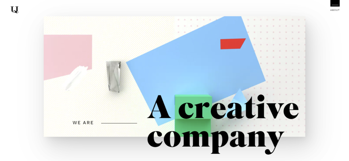
If you want to take your website to the next level and engage your audience through the use of visuals, then a broken grid may be a good choice for you. A broken grid web design normally makes an impact through visually-appealing pages with arrangements that consist of overlapping images, asymmetrical texts, and more. This design takes you out of the norm and takes it up a notch because it’s not the usual way of displaying texts and images on web pages. That’s why it allows you to stand out and make your business easy to tell apart from your competitors.
4. Retro Design
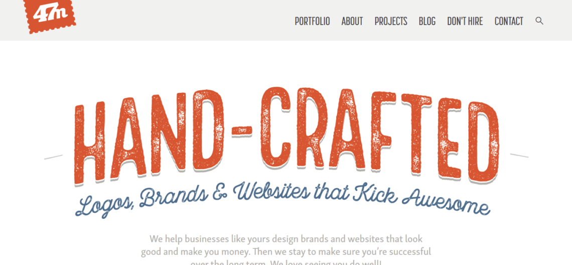
Let’s be honest, retro never goes out of style because it’s the feeling of nostalgia that makes it appealing to people, may it be in clothing or furniture — and that also applies to web design. Since the online world is moving at a fast pace, going for a retro-themed web design is like slowing things down and taking a step back. This design also creates a sentimental, fun, and cozy, yet functional look and feel to the website, which can easily catch the attention of users.
There are different web design types that you can choose from depending on your preferences as they also have varying distinctive features — all of which will give the sense of reminiscing the past.
- Bauhaus
- Bauhaus is characterized by its simplicity because it centers on simple texts, primary colors, thick lines, geometric shapes, and more.
- Art Deco
- Art Deco represents popular design during the 1920s and 1930s, and can be determined by the beautiful ornamentation it consists of, and alongside that are the bold geometric shapes, rich color combinations, and more. This design also highlights the rise of machine culture and its effect on society.
- Art Deco represents popular design during the 1920s and 1930s, and can be determined by the beautiful ornamentation it consists of, and alongside that are the bold geometric shapes, rich color combinations, and more. This design also highlights the rise of machine culture and its effect on society.
- Art Nouveau
- Art Nouveau is inspired by various natural forms. It focuses on creating a seamless relation between elements and natural forms, so it mostly consists of straight lines and floral structures. Art Nouveau also makes use of artistic designs on everyday objects, pastel colors, as well as flowing lines.
- Dada
- Dada is a product of various innovative movements, which is why there’s no one idea that describes this design. But it can still be characterized by the use of red and black colors to create contrast, print, collage, graphics, and element placements.
Here are some of the things you may want to take note if you’re considering going all-out nostalgic for your website:
- Colors
- When it comes to the colors used in retro design, keep in mind that bright colors are not a viable option for you because it doesn’t match the kind of premise that retro design is building. The saturation should also be reduced to make the images look old or classic.
- Shapes
- Geometric shapes, such as rectangles and circles are prominently used in retro web designs. Straight lines are also used and are commonly combined with different shapes and floral designs.
- Geometric shapes, such as rectangles and circles are prominently used in retro web designs. Straight lines are also used and are commonly combined with different shapes and floral designs.
- Typography
- Choosing the right font in retro design is essential because it is what makes the design look and feel even more nostalgic. It’s best to choose a font that looks old — so you may want to go for fonts such as Morro, Cuppacabra, Oaklash, Hastron, Retrofunk, and more.
The overall design of your website plays a huge role in engaging your visitors. An outdated web design would make it more difficult to draw people’s attention, let alone make them stay and want to check your business. That’s why it’s always good to be in the know on the latest and must-try designs you can use to make your website stand out.
Related: 8 Reasons to Redesign Your Website
Do you need help a web design company to help you with your website? Contact us today, and we’ll be glad to help you!


