Websites are highly needed by anyone that wants their products or services be known to the public. With 3.7 billion unique users online, most people search for what they are looking for to cater their needs and information online. Corporate web design from its layout to presentation should embody your company or your company’s goals itself. Having corporate website inspirations can help you figure out what you want on your corporate website.

From all of the corporate website inspirations that you will sought out, find what can make your future website unique and stand out form others. Remember that you are creating your website for potential clients or customers in order to for them to avail your products or services.
Here are some business/corporate websites inspirations that can help you build a professional website that you’ll need.
1. Artisan Talent
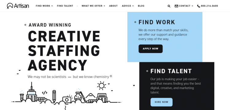
Whether you are looking for work or looking for a talent, they are a creative staffing agency that can help you. Their website is really easy to navigate, you can easily find everything that you are looking for with their creative call-to-actions and simple little animations.
2. Big Spaceship
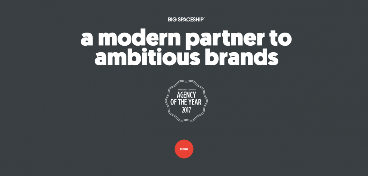
They help organizations connect with audiences through a deep understanding of culture and behavior in the field of marketing and advertising. They have a big website, you got that right, big. Fonts are bold, catchy, and has a very youthful yet professional approach.
3. Chadwick Designs
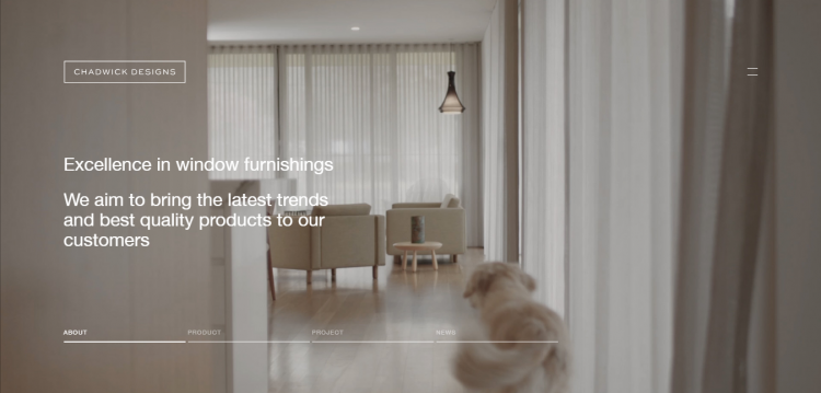
Chadwick Designs provides expert window furnishings advice and installation to interior designers, architects and home. Their website is very minimalist yet interesting as they showcase so much about their business. Chadwick Designs truly reflect what their business is all about through their website.
4. Checkout
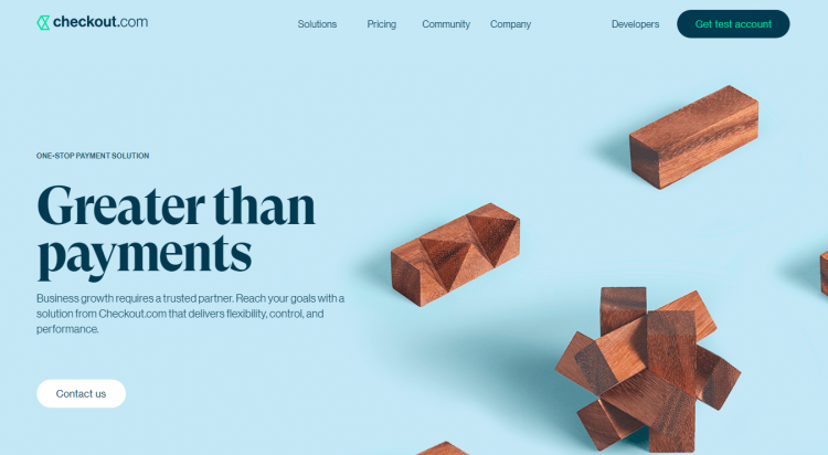
Checkout.com is a leading international provider of online payment solutions. A very simple, light colored website that is easy to navigate. Who says corporate websites can’t pull broken grids? This website is unafraid to use it on their layout which some web designers or developers find it tricky to manage.
5. The Craft
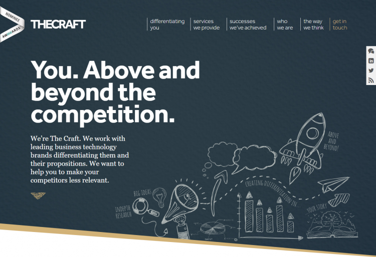
The Craft is a strategic consultancy that helps clients to compete at the very highest level and build a sustainable competitive advantage in their markets. They have a very simple yet detailed website wherein you can find all you need in just one page.
6. Diehl Group Architects
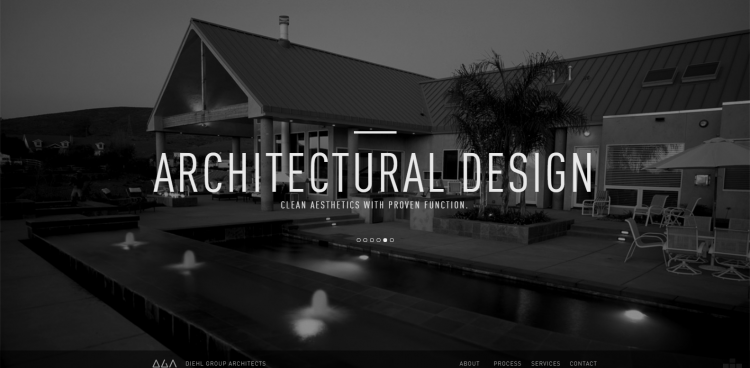
They are a full-service design and consulting firm specializing in forensic architecture, quality assurance, and expert witness testimony. Their homepage has everything that you need, from their company’s about to their services, they all placed it in just one page. With shades of black and gray, DGA’s website has a minimalistic and elegant approach that reflects their brand.
7. EastWest BPO
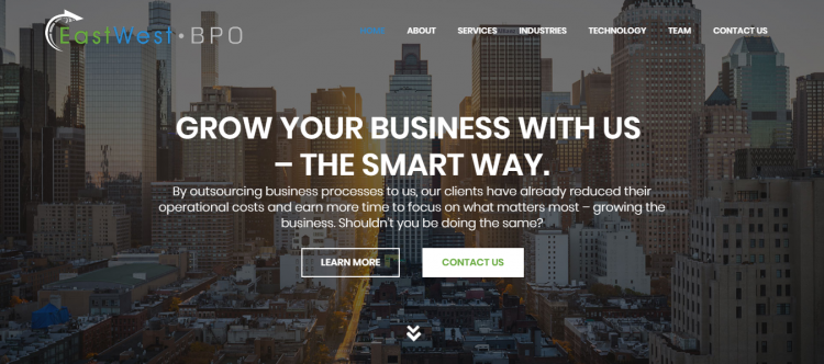
They started as a VOIP telco company, playing with the idea of expanding to BPO Services. Their website has everything that you need, from detailed content to chatting with their customer service for inquiries, they have it all for you. They also have a very detailed content on their services which explains how every single service of theirs can help you.
8. HikeUp
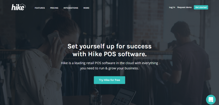
Hike is a leading retail POS software in the cloud with everything you need to run & grow your business. Their website is easy to navigate, they have all what you need laid out on their homepage. It is easy to access their other pages with their simple yet informative website.
9. Humanique
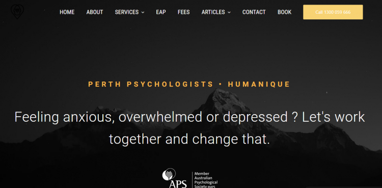
They are an extended-hours psychology practice in the heart of Perth City. They help people with a broad range of mental health concerns. With corporate websites like this, it has to be inviting when it comes to users that are seeking for help such this. Their call-to-action buttons are wide enough to catch user’s attention. You can also chat or book an appointment with an experienced psychologist. This option makes it easy and convenient for users.
10. iGotcha Media
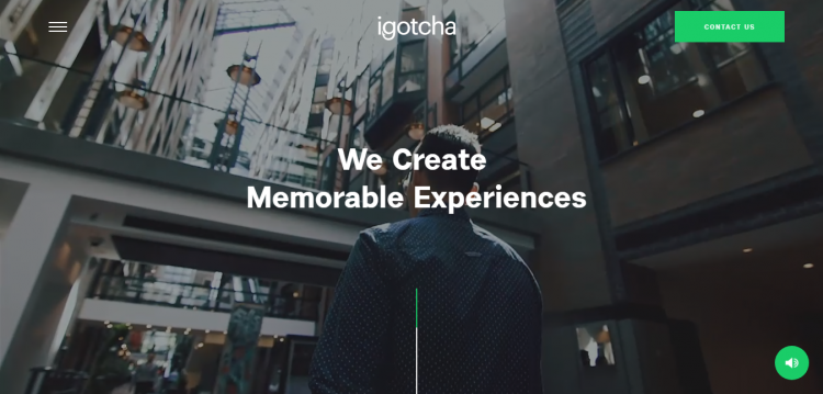
iGotcha Media is a leading provider of powerful, customized interactive and digital signage solutions. Their website welcomes you with videos of their team and what they do. They also have broken grid layouts, this is one of website trends of 2018. (link to website trends of 2018)
11. Mailchimp
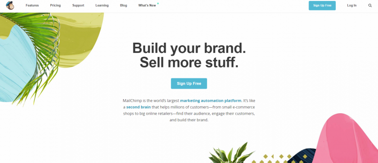
MailChimp is the world’s largest marketing automation platform for small business. Bold fonts, unsymmetrical grids and colorful designs, they’re website is visually appealing and allows users to easily read what they’re offering.
12. Mobify
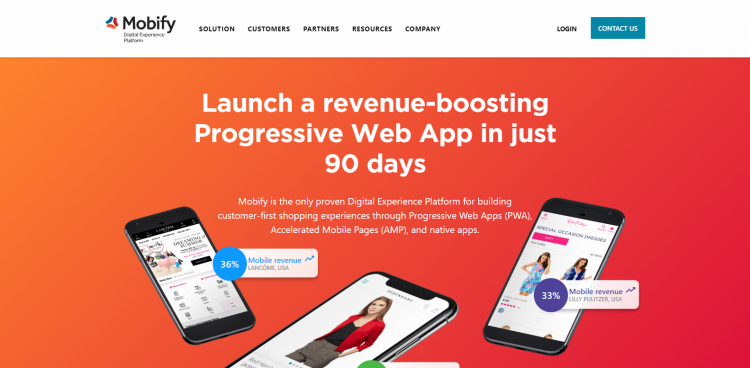
Mobify is a mobile shopping platform that helps enterprise retailers create shopping experiences across every mobile touchpoint. Mobify’s website is filled with vibrant colors and bold fonts which is one of the trends in today’s time.
13. Radian
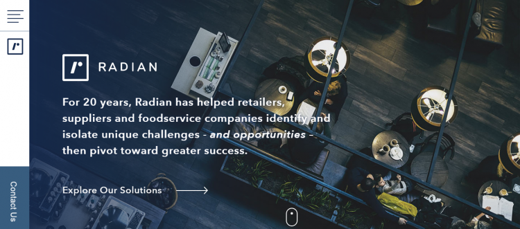
Radian has helped retailers, suppliers and foodservice companies identify and isolate unique challenges – and opportunities. They have quite of a minimalistic approach yet detailed. If you want to achieve a website that is filled with content yet minimalistic, add this to your list of corporate website inspirations.
14. Second City
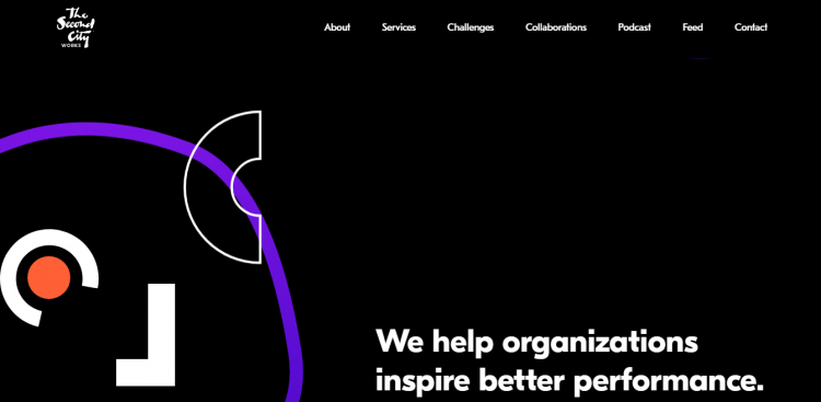
Second City has produced some of the most unforgettable satire and influential comedians of the last sixty years. With uneven grids and small animations that happen every time you scroll through, you might think that it’s not mobile friendly, but guess what? They won an award for Mobile Excellence of the Week!
15. Sophos
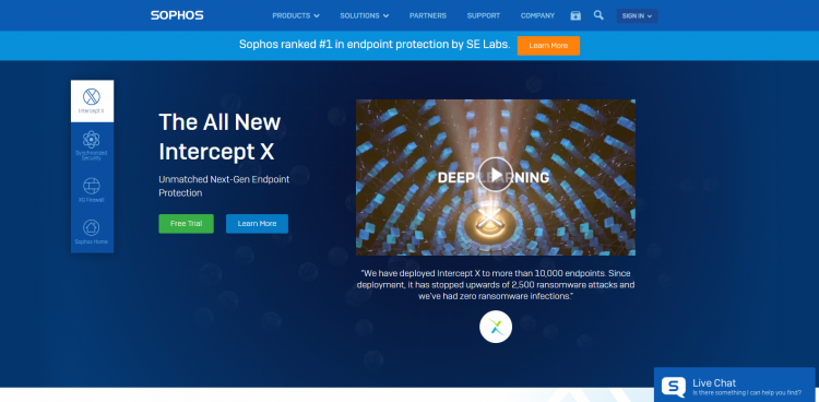
Sophos Group is a British security software and hardware company. Their company develops products for communication endpoint, encryption, network security, email security, mobile security and unified threat management. They have a simple yet detailed website giving you everything that you need on their landing page. They instantly have three call-to-action buttons that can catch users’ attention.
16. S&P
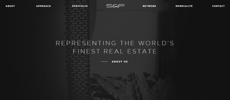
S&P is an international real estate boutique specializing in the design, marketing and sale of luxury and super prime real estate. Another modern minimalist type of website. They also have a different approach to their call-to-action.
17. Trainstation
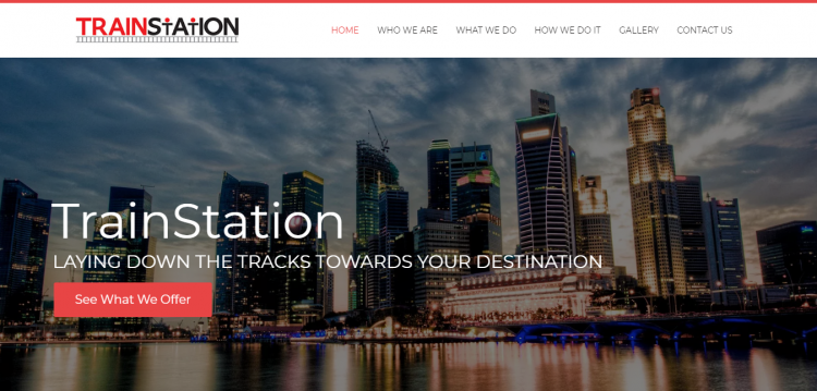
Trainstation is a motivational marketing company that specializes in corporate and public training workshops for organizational development and personal enhancement. Their website has vibrant colors and large fonts, call-to-action buttons that can easily catch the eyes of a user.
18. Venmo
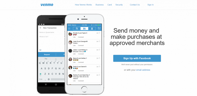
Venmo is a mobile payment service owned by PayPal. It allows users to transfer money to others using the service using a mobile phone app; both the sender and receiver have to live in the U.S. A simple homepage with white layout and an animation of phones receiving money.
19. Wingman Dubai
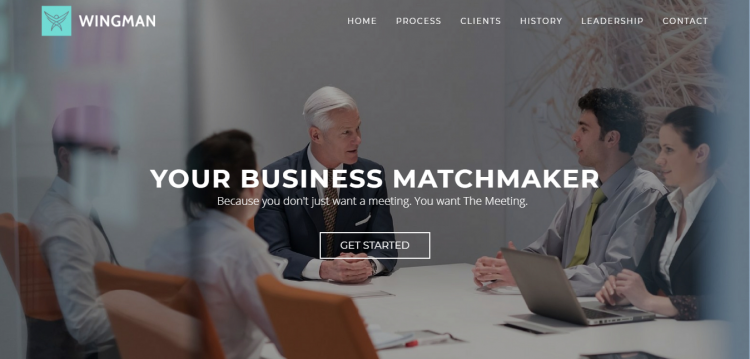
The Wingman is a business development agency based in Dubai that help companies with appointment setting, lead generation and inside sales in the Middle East in their quest for new clients and growth. They have a corporate website portfolio which allows them to showcase what they are all about, their clients, team and how they do their business.
20. Zendesk
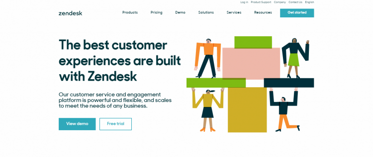
You might be familiar with Zendesk if you have seen them in different websites, especially in eCommerce websites. Zendesk Inc. is a Danish customer service software company headquartered in San Francisco, California, USA. Eye-catchy call-to-action buttons that are irresistible to click wins the game. It makes it easier for the user to get what they need and learn more of what this company offers.
We hope that these corporate website inspirations inspired you on your future website. Have an idea in mind? Contact us today and we can help you with our web design and development services and more!


