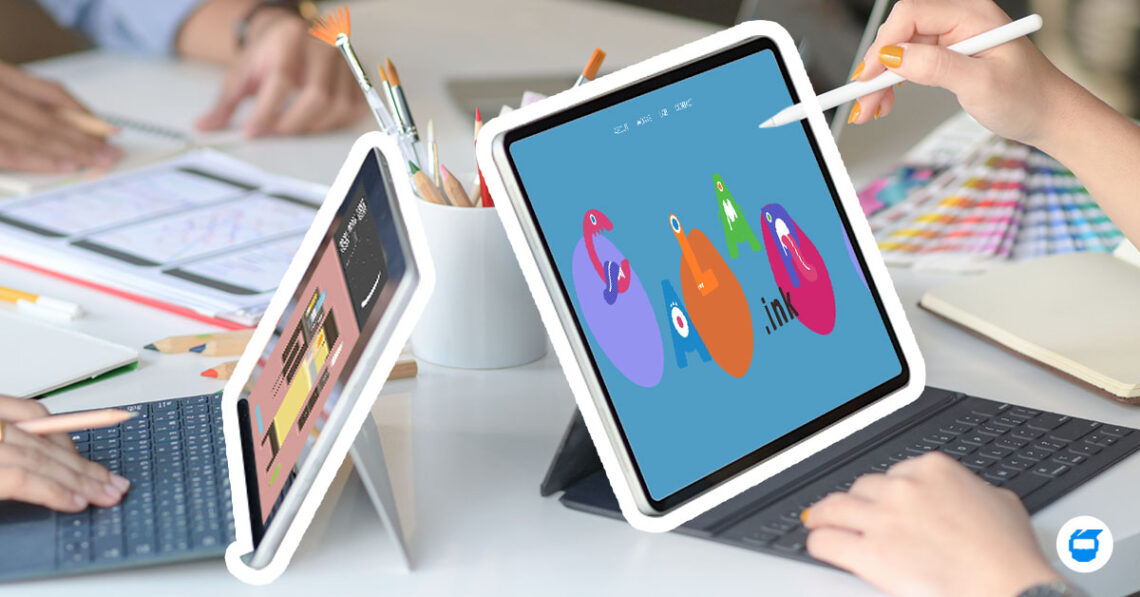
The digital world is fast-growing and evolving, and with trends easily coming and going, users expect more dynamic and engaging experiences from websites. To meet user needs, one of the most effective ways is to enhance user experience through microinteractions and animations. These elements, when used correctly, can make a website more engaging, interactive, and significant.

Related: Enhancing User Experience with Microinteractions and Animations in Web Design
Here’s a list if tips to help elevate user experience through microinteractions and animations:
1. Keep It Simple
When using microinteractions, focus on making them as simple and intuitive as possible. The user should be able to understand the microinteraction without needing to think about it. For example, a ‘like’ button on a social media site should be obvious and easy to use, rather than hidden or difficult to find.
2. Provide Feedback Through Microinteractions
Use microinteractions to provide feedback to the user, such as indicating that an action has been completed or that an error has occurred. This helps the user understand the outcome of their actions and guides them through the use of the website.
3. Guide the User
Use microinteractions to guide the user through a process, such as a sign-up form, or to help them discover new features. Doing so enables the user to navigate and interact with the website more efficiently.
4. Add Visual Interest
Use animations to add visual interest and guide the user’s attention. But keep in mind that too many or lengthy animations can be overwhelming and distracting for the user. It’s essential to strike a balance between adding visual interest and not overwhelming the user.
5. Give Feedback Through Animations
Use animations to provide feedback on an action, such as a button press because it aids the user in understanding the outcome of their actions and guides them through the use of the website.
6. Create a Sense of Movement
Animations do not only add visual appeal to the website, but it can also create a sense of movement and energy that will make the website more engaging and dynamic, helping to catch the user’s attention.
7. Keep It Responsive
Ensure that the animations and microinteractions are smooth and responsive, so as not to negatively impact the user experience. A poor performance can cause frustration and make the user leave the website.
8. Focus on Purpose
Remember that microinteractions and animations should serve a purpose to enhance the user experience, rather than being used for the sake of it.
9. Make It Accessible
Consider inclusive design and ensure that the website is accessible to users with disabilities. This includes users with visual, auditory, motor, and cognitive impairments, and users with slow internet connection. Some of the steps you shouldn’t skip when designing an inclusive website include being mindful of the color use and contrasts, ensuring responsiveness on types of devices, using a content management system (CMS) that supports accessibility, and more.
10. Test and Iterate
Continuously test and iterate the microinteractions and animations to ensure that they are effective in enhancing the user experience. User testing is an essential step to understanding how users interact with the website and how you can further improve it.
To conclude, microinteractions and animations are significant factors of web design that can help to enhance the user experience and make a website more engaging and interactive. By keeping in mind their purpose, performance, and inclusivity, designers can use them to create a more dynamic and enjoyable user experience. The use of these elements in web design is becoming increasingly important as technology advances and users come to expect more dynamic and engaging experiences.
Do you need help with the web design of your business? Contact us today, and we’ll be glad to assist you!


