Chatbots, animation, asymmetry and richer background patterns started back in 2017 and now it’s about to grow more this 2018. Web designs lately has started to have purpose, aside from making it appealing to your readers or potential consumers, some have been interactive and innovative where users get to get in touch closer to the company’s ideas and goals.
Digital innovation will become faster and will push the limits of design trends here in the Philippines. User friendly, clear and innovative, consistent and especially mobile friendly as almost everyone relies on their phone when looking through websites on the internet as Wi-Fi has been widely available anywhere. Do you know what’s hot this 2018 for web design? If not, we will let you know the top 5 web design trends this 2018.
1. Large Fonts and Vibrant Colors
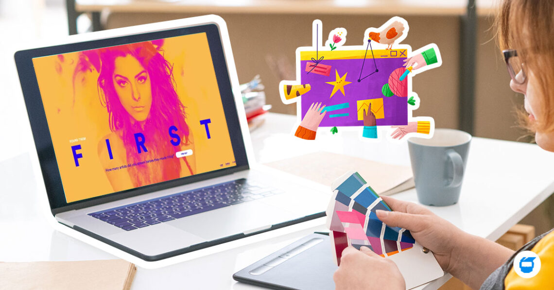
Typography has been one of the powerful tools when it comes to web design. Recently as it started a year or two ago, the contrast of two or more fonts has been looking aesthetically pleasing for many. The bigger the better as you must catch the attention of your readers using your colors and design; it also helps your reader focus on your content.
Adding vibrant colors to your web design creates a dynamic experience for your reader or customers. With vibrant colors and large fonts, your website will look more interesting and will give users an easy and enjoyable experience.
2. Animation
Web animation plays a huge part in making ideas and can tell the story in an easy way. It can simply show the brand’s strength and personality in just seconds. What’s best with animations, it conveys complex ideas in a short amount of time. Rather than having static content on your website, it makes it dynamic using the animation.
Animated logos have been recently used by some companies and it does a big factor in enhancing the brand’s company. Though using animation in web design has been a trend, it still must be right for your company’s project.
3. Use of Artificial Intelligence
Voice assistance such as Google Home, Apple’s Siri, smarthome devices and chatbots has became a trend on the web. Some examples of Artificial Intelligence on websites are the ones used in streaming websites such as Netflix where they give you recommendations of movies or series from last one that you have watched. Another one is the use of voice assistants, just tell them what you need, and they’ll answer back to you right away. On Facebook, face recognition has become a thing to easily tag a person in a photo.
It competes with the mainstream and traditional web design and looks more advanced and makes the website appear polished. It no longer can be seen in movies and AI is finally being used in the web that you might not actually notice that you are using AI in your everyday life.
4. Broken Grid Layouts
This trend started in 2010 and grew as bigger brands has started using this trend. With its revolutionized design, it enables the users to use the website on mobile. Asymmetrical or broken grid layouts is about grabbing the readers’ attention as they tend to look more on the texts and photos. It may look heavy but it is simple. Some designers stay away from it because it is tricky to use because with the wrong placements of content, the design can be confusing. When using this type of layout, you must know what you want your visuals to accomplish. Broken grid layouts makes the website more creative and gives the brand a bold character.
5. Mobile First
Websites are continuously growing in making their websites compatible with mobile devices. Web designers are more focused on creating their content that is focused on compatibility. It is convenient as most people can access almost anything on the internet using their mobile devices.
Traditional mobile websites might take a while to load but now, an open-source coding standard for publishers has been launched. Accelerated Mobile Pages or AMP is a good thing for making your website blazing fast but it won’t work for all types of website, it still has some limitations to where you can apply it. Many users are getting familiar with AMP and what it offers and there is a big probability that searchers from Google will most likely to click on your website if you have that small lightning bolt next to your website’s content on the search engine.
2018 will be filled with powerful designs yet simple to understand in order to connect with users everywhere. Websites will be more innovative and aesthetically pleasing since these trends will increase more as web designers aim to give their readers their best reading experience. We can help you think outside the box with these trends for your website. Contact us today!


