Whether you’re a design enthusiast or just someone curious about the buzz surrounding dark mode, this article is your guide to understanding, appreciating, and implementing this eye-friendly trend in web design.

Table of Contents
- What is Dark Mode Design?
- Key Characteristics of Dark Mode
- Benefits of Dark Mode Design
- Implementing Dark Mode in Web Design
- Challenges and Considerations
What is Dark Mode Design?
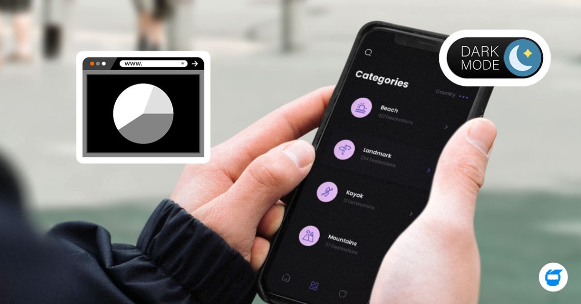
Dark mode design is like the cool, sophisticated cousin of the traditional light mode. Instead of bright backgrounds and darker text, dark mode flips the script, embracing darker backgrounds with lighter text and elements. It’s a visual overhaul that not only looks chic but also comes with some impressive perks.
Key Characteristics of Dark Mode
1. Dark Background Magic
Imagine your screen dressed in shades of black, dark gray, or navy blue— that’s the signature dark mode background.
2. Light Text and Elements Pop
To make things pop, dark mode uses light-colored text and elements, creating a striking contrast against the dark canvas.
3. Bye-Bye Blue Light
Dark mode is known to be kinder to your eyes by emitting less blue light. You can say goodbye to eye strain, especially during those late-night browsing sessions.
Benefits of Dark Mode Design
1. Reduced Eye Strain: Say Goodbye to Squinting!
Like we’ve mentioned above, utilizing dark mode reduces eye strain. The reduced blue light emission is like a soothing balm for your eyes, making it a popular choice for users glued to their screens for extended periods.
2. Battery Life Boost (for OLED Screens): Energy-Saving!
If your device has an OLED screen, dark mode can be your energy-saving hero. Dark pixels emit less light, translating to lower power consumption and extended battery life. It’s a win-win for your device and the environment.
3. Visual Aesthetics and Style: Dark Is the New Black!
Beyond being eye-friendly, dark mode has become a design trend that’s all about looking cool. Apps and websites are embracing it not only for its practical benefits, but also because it’s, well, downright stylish.
Implementing Dark Mode in Web Design
Now, let’s get hands-on with incorporating dark mode into your web design endeavors.
1. Responsive Design: The Chameleon Effect
Make your dark mode design responsive. Think of it like a chameleon — adapting seamlessly to different environments. Users love having the flexibility to switch between light and dark modes based on their preferences or the lighting around them.
Related: What Is Responsive Web Design? Crafting Sites for Every Screen Size
2. Contrast is Your Best Friend: Don’t Blend In!
Maintaining a balanced contrast is the secret sauce of a successful dark mode design. It’s not just about looking cool; it’s about readability and accessibility. Test your design with real users to ensure it meets the gold standards of accessibility.
3. Consistent Branding: Dark Doesn’t Mean a Branding Detour!
If you’re designing for a brand, see to it that your design aligns with the overall brand image. Consistency is key in creating a seamless user experience across different modes.
4. User-Friendly Toggle: Give Them the Power!
Empower your users with a user-friendly toggle switch. Make it easy to find and access, either in the settings or boldly placed in the interface.
Challenges and Considerations in Dark Mode Design
While dark mode is a superhero in many ways, every hero has its challenges:
1. Color Accuracy: Avoid the Hue Confusion!
Be cautious of color accuracy. Dark mode can sometimes play tricks on your color perception, so choose your colors wisely to maintain accuracy in both light and dark modes.
2. User Preferences Matter: One Size Doesn’t Fit All!
Remember that everyone has their preferences. While many users are hopping on the dark mode bandwagon, some still prefer the classic light mode. Offering both options ensures that your design caters to a diverse audience.
Dark mode design isn’t just a passing trend; it’s a revolution in the way we experience digital interfaces. Beyond its practical advantages, it adds a touch of class and sophistication to the digital realm. So, whether you’re a designer aiming for the cutting edge or a user seeking a more comfortable browsing experience, dark mode is the answer.
Incorporating dark mode into your web design toolkit isn’t just about following the crowd; it’s about enhancing user comfort, embracing accessibility, and making a statement. Dark mode isn’t just a design choice; it’s a lifestyle—stylish, practical, and here to stay.
Looking for web design services for your business? Contact us today, and we’ll be glad to assist you!

